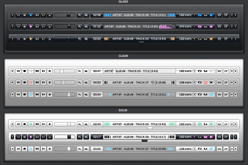
New default skin

About usage, announcement and development of skins for VLC
dionoea
Cone Master
Cone Master
Posts: 5157
Joined: 03 Dec 2003 23:09
Location: Paris, France

New default skin

Postby dionoea » 05 Apr 2006 22:44

Hello,

We all want to change the default VLC skin. We'll do a skins design contest for 0.8.6 (we unfortunately don't have the time to do it for 0.8.5 which should be released in a few weeks). I thus asked aLtgLasS if he could do one for 0.8.5. Looks like he accepted which is great :)

I'm now starting this new forum thread to discuss this skin and it's requirements.
http://wiki.videolan.org/index.php/Defa ... quirements already has some stuff. Feel free to post comments concerning the skin (and design ideas).
Antoine Cellerier
dionoea
(Please do not use private messages for support questions)

3breadt
Big Cone-huna
Big Cone-huna
Posts: 827
Joined: 19 Mar 2006 11:37
Operating System: Win7 Pro / OS X 10.7
Location: Paderborn, Germany
Contact:

Postby 3breadt » 06 Apr 2006 13:30

I already have an idea for the skin, all i can say now is that it will be a dark skin. I planned also to add animations to the skin, which i haven't done with my previous skins. As I have holidays the next two weeks i will have plenty of time for developing the skin. :D
-- 3breadt (aka altglass)

Asim
Cone that earned his stripes
Posts: 151
Joined: 30 Mar 2005 05:58
Contact:

Postby Asim » 06 Apr 2006 16:32

you're not the only one ;)

3breadt
Big Cone-huna
Big Cone-huna
Posts: 827
Joined: 19 Mar 2006 11:37
Operating System: Win7 Pro / OS X 10.7
Location: Paderborn, Germany
Contact:

Postby 3breadt » 10 Apr 2006 17:40

A first preview how it will possibly look like.
Please give comments and feel free to post ideas for improvement.
Image
-- 3breadt (aka altglass)

dionoea
Cone Master
Cone Master
Posts: 5157
Joined: 03 Dec 2003 23:09
Location: Paris, France

Postby dionoea » 10 Apr 2006 22:34

I liked the glass effects on previous skins ... this one seems a bit too simple :) (and it looks like you used Excel to position the buttons and labels ... no offence :p )
Antoine Cellerier
dionoea
(Please do not use private messages for support questions)

Khamelion
Blank Cone
Blank Cone
Posts: 45
Joined: 06 Apr 2006 03:05

Postby Khamelion » 11 Apr 2006 02:25

I liked also the glass effects more than this one.
Perhaps you'll get inspirate by the ClearOne Skin from winamp.
Image
I really love that transparent glass effect und the blue shining Buttons.
I would do it myself if i have the skills and the experience to do that :oops:
I would also recommend to integrate the video with the player like the old skin.
I don't like the seperate windows, 'cause it's very annoying moving two windows.

3breadt
Big Cone-huna
Big Cone-huna
Posts: 827
Joined: 19 Mar 2006 11:37
Operating System: Win7 Pro / OS X 10.7
Location: Paderborn, Germany
Contact:

Postby 3breadt » 11 Apr 2006 12:13

Can you please mail me the ClearOne Skin to ****. Because I have only the one color Beta Version and I cant find the final version available for download.

I'll redo the complete skin :) Will be more glassy.
Last edited by 3breadt on 23 Apr 2009 10:53, edited 1 time in total.
-- 3breadt (aka altglass)

3breadt
Big Cone-huna
Big Cone-huna
Posts: 827
Joined: 19 Mar 2006 11:37
Operating System: Win7 Pro / OS X 10.7
Location: Paderborn, Germany
Contact:

Postby 3breadt » 11 Apr 2006 13:07

What about this:
Image
-- 3breadt (aka altglass)

dionoea
Cone Master
Cone Master
Posts: 5157
Joined: 03 Dec 2003 23:09
Location: Paris, France

Postby dionoea » 11 Apr 2006 14:53

Seems to be a good idea. You need to make the playlist and video parts hideable (don't know if that word actualy exists ...). Or maybe just make a "minimized" layout.

One more thing about the colors: people on IRC were asking why people always wanted "dark" skins. If it isn't too complicated, you could try doing a "white" layout and a "black" layout and a button to toggle the current layout (kind of like what xanax initialy did for his 3 color skin).
Antoine Cellerier
dionoea
(Please do not use private messages for support questions)

Khamelion
Blank Cone
Blank Cone
Posts: 45
Joined: 06 Apr 2006 03:05

Postby Khamelion » 11 Apr 2006 15:11

It looks better, but don' forget the volume control and the playlist button .
I also miss the bar to "move" the Video/Audio, minimize/maximize, close button and the menubar, but this is only a preview version so it is excusable :D

I tried to send you an email with the clearone skin, but I get a returned email and that this adress doesn't exist.

@dionoea I think he wants to make the "dark fields" transparent or maybe in glass if possible. If not I would also prefer different color skins.

P.S. "hideable" doesn't exist, but you can say "hide automatically" ;)

Asim
Cone that earned his stripes
Posts: 151
Joined: 30 Mar 2005 05:58
Contact:

Postby Asim » 12 Apr 2006 04:26

i think ill be showing my skin once its fully complete ;)

3breadt
Big Cone-huna
Big Cone-huna
Posts: 827
Joined: 19 Mar 2006 11:37
Operating System: Win7 Pro / OS X 10.7
Location: Paderborn, Germany
Contact:

Postby 3breadt » 13 Apr 2006 17:21

Updated Preview:
Image
-- 3breadt (aka altglass)

3breadt
Big Cone-huna
Big Cone-huna
Posts: 827
Joined: 19 Mar 2006 11:37
Operating System: Win7 Pro / OS X 10.7
Location: Paderborn, Germany
Contact:

Postby 3breadt » 16 Apr 2006 11:02

So ATM i finished:
-Most Part of the Skin Layout for main window and minimal window
-Dark Blue Normal State Images
-Dark Blue Pressed State Images

Yet to do:
-Dark Blue Animated Hover State Images
-All Images for Light Orange Skin
-Implement DVD Buttons

Screenshot:
Image

Image
-- 3breadt (aka altglass)

Khamelion
Blank Cone
Blank Cone
Posts: 45
Joined: 06 Apr 2006 03:05

Postby Khamelion » 16 Apr 2006 13:35

Well first of all. Great Job. :D It looks really good but there are some critics I want to make.

First I don't really like the font you choose.
I would like it , if the font look more cleary like Windows Vista new font Segoe UI.
It is in a way too dark. Perhaps a mix with grey and white would be better.
I would also prefer split buttons and not a group of buttons.
and don't forget the minimize button!

But the rest looks amazing :)

P.S. Do you still need the ClearOne skin. I try to send it to you, but it was not possible with your email adress.

3breadt
Big Cone-huna
Big Cone-huna
Posts: 827
Joined: 19 Mar 2006 11:37
Operating System: Win7 Pro / OS X 10.7
Location: Paderborn, Germany
Contact:

Postby 3breadt » 16 Apr 2006 13:53

I'll release to skins, one dark one with blue and a light one with orange display.
I chose the font so that it fits the digital display style. Maybe I'll add a button for changing the font or sth like that, but where to put it?
-- 3breadt (aka altglass)

Khamelion
Blank Cone
Blank Cone
Posts: 45
Joined: 06 Apr 2006 03:05

Postby Khamelion » 16 Apr 2006 14:12

Well, when I'm looking at all the other media player's default skins, they never had some special font for a skin.
Just remember it'll be the new vlc default skin and for a default skin is a clear font better.
Perhaps you can relase this version as a special skin for vlc.
But maybe the developers are satisfied with your current skin.

dionoea
Cone Master
Cone Master
Posts: 5157
Joined: 03 Dec 2003 23:09
Location: Paris, France

Postby dionoea » 16 Apr 2006 14:33

Looks good :) (do you have previews of the "light" version ?)
Antoine Cellerier
dionoea
(Please do not use private messages for support questions)

3breadt
Big Cone-huna
Big Cone-huna
Posts: 827
Joined: 19 Mar 2006 11:37
Operating System: Win7 Pro / OS X 10.7
Location: Paderborn, Germany
Contact:

Postby 3breadt » 18 Apr 2006 11:11

I decided first to release non-animated skins.

Why? Because creating animations is very time consuming and when they are displayed in vlc they sometimes cause the other displays (Scrolling Text/Updating Time Display) to lag a little bit.

So: The Light Skin won't have any animations.
The Blue one will have all buttons animated(7 out of 22 are finished allready).

Here a preview release of the Dark Blue Skin, without animations(except the close button)

http://altglass.al.funpic.de/d-gfx/stuf ... ations.vlt
-- 3breadt (aka altglass)

3breadt
Big Cone-huna
Big Cone-huna
Posts: 827
Joined: 19 Mar 2006 11:37
Operating System: Win7 Pro / OS X 10.7
Location: Paderborn, Germany
Contact:

Postby 3breadt » 18 Apr 2006 11:34

Is this colorization acceptable for the light skin?
Image
-- 3breadt (aka altglass)

Khamelion
Blank Cone
Blank Cone
Posts: 45
Joined: 06 Apr 2006 03:05

Postby Khamelion » 18 Apr 2006 20:07

I like that skin. It looks like the VLC Icon :D
But I hope you also have the standard colors available.
Green, Red, Blue, White, Black.
If it is too complicated then let it be ;)

Edit: Some critics of your actual version
I made a screenshot of the visual correction.
Image
You can also replace the Playlist-buttons over the Playlist window

to overcrowded = TOO overcrowded xD

- Is it not possible to make a menubar on the top, like the standard skin?
- When I'm trying to open a playlist or the options it opens the window in the background.

I'm not trying to say something bad about your skin. I only want to correct some things to make it better ;)

3breadt
Big Cone-huna
Big Cone-huna
Posts: 827
Joined: 19 Mar 2006 11:37
Operating System: Win7 Pro / OS X 10.7
Location: Paderborn, Germany
Contact:

Postby 3breadt » 19 Apr 2006 08:57

Other Colors humm. I don't think so. Too much effort involved and not so much time left until the release of 0.8.5, so...

The colored bars at the bottom/top are intented to be there.
Maximize is not possible in the skins2 mode. Minimize will be implemented.
I now that you don't like the font, but I like it -.-. As I'll add a minimize button, I have to change the layout of the minimal mode anyway. So perhaps you'll see the FreeSans Font there, too.

I would like to hear the attitude of other toward Overcrowdedness and hideability, too.
//EDIT: Concerning the Overcrowdedness, I need all the buttons I put there, so I don't thin that it's overcrowded.

The Volume outside the eq? Why? Its all about sound control, so are together just fine i think.

Menubar? You mean like File->Open and Stuff?. That would take really a lot of effort to create, and I am not keen on doing that :).
That the Windows open in the background I cant change, its always so.
-- 3breadt (aka altglass)

Khamelion
Blank Cone
Blank Cone
Posts: 45
Joined: 06 Apr 2006 03:05

Postby Khamelion » 19 Apr 2006 11:23

The Volume outside the eq? Why? Its all about sound control, so are together just fine i think.
I just though if you could deactivate the EQ you still need the volume.
Sometimes you just don't need the Playlist or the EQ.
How about making sperate Windows for EQ and Playlist.

3breadt
Big Cone-huna
Big Cone-huna
Posts: 827
Joined: 19 Mar 2006 11:37
Operating System: Win7 Pro / OS X 10.7
Location: Paderborn, Germany
Contact:

Postby 3breadt » 19 Apr 2006 11:56

The volume control isnt disabled when the eq is disabled, making seperated windows seems to take too much time now, and you are not representative for the whole community :) Some will like it some won't Don't take it wrong but I'm fed up now with changes in the basic layout. It'll stay like this.
-- 3breadt (aka altglass)

dionoea
Cone Master
Cone Master
Posts: 5157
Joined: 03 Dec 2003 23:09
Location: Paris, France

Postby dionoea » 19 Apr 2006 12:40

Some more comments (the concept is begining to look good :D)

I kind of agree that it would be a good idea to make it possible to hide the playlist and equalizer. They take lots of space and people sometimes want the player to take as little space as possible.

Concerning the light version, i'm not too fond about the massive use of orange. Don't know what other people think about that color choice :)
Antoine Cellerier
dionoea
(Please do not use private messages for support questions)

3breadt
Big Cone-huna
Big Cone-huna
Posts: 827
Joined: 19 Mar 2006 11:37
Operating System: Win7 Pro / OS X 10.7
Location: Paderborn, Germany
Contact:

Postby 3breadt » 19 Apr 2006 12:50

Updated the Dark/Blue Version:
-added minimize Button
-added DVD Buttons
-Changed Font
http://altglass.al.funpic.de/d-gfx/stuf ... ations.vlt

Uploaded Light/Orange Version:
http://altglass.al.funpic.de/d-gfx/stuf ... range).vlt
-- 3breadt (aka altglass)


Return to “Skins”

Who is online

Users browsing this forum: No registered users and 7 guests