Old skin (classic 0.8.*) on new version (0.9.2)

For questions and discussion that is NOT (I repeat NOT) specific to a certain Operating System.
hobolooter
New Cone
New Cone
Posts: 1
Joined: 26 Oct 2008 18:39

Re: Old skin (classic 0.8.*) on new version (0.9.2)

Postby hobolooter » 26 Oct 2008 18:49

No way. Sorry.
I'm sorry, but seriously? I just registered an account to express my distain for even a reasonable explanation of why you like the new interface so much? It's really a step backwards. Just like neverneverland said, I'm sure if you took a vote you'd be surprised how many people hate the new look. I mean by completely ignoring requests you might as well just make VLC completely proprietary closed source and start charging for it.

Just sucks that I too, ended up downgrading over something as silly as an interface. I mean it's not even in the same ballpark as the old interface, otherwise I wouldn't be complaining at all. But as a user and someone who noticed a real problem... Just take it into consideration, or optionally find an interface designer who can help out. I'd be happy to whip up a new look for you, and it would start with buttons that are the same size.

Jean-Baptiste Kempf
Site Administrator
Site Administrator
Posts: 37523
Joined: 22 Jul 2005 15:29
VLC version: 4.0.0-git
Operating System: Linux, Windows, Mac
Location: Cone, France
Contact:

Re: Old skin (classic 0.8.*) on new version (0.9.2)

Postby Jean-Baptiste Kempf » 26 Oct 2008 19:17

No way. Sorry.
I'm sorry, but seriously? I just registered an account to express my distain for even a reasonable explanation of why you like the new interface so much? It's really a step backwards. Just like neverneverland said, I'm sure if you took a vote you'd be surprised how many people hate the new look. I mean by completely ignoring requests you might as well just make VLC completely proprietary closed source and start charging for it.

Just sucks that I too, ended up downgrading over something as silly as an interface. I mean it's not even in the same ballpark as the old interface, otherwise I wouldn't be complaining at all. But as a user and someone who noticed a real problem... Just take it into consideration, or optionally find an interface designer who can help out. I'd be happy to whip up a new look for you, and it would start with buttons that are the same size.
No way. Why ?

For the n<sup>th</sup> time, because we changed toolkits for Interface.

About the complaints and vote, the users return is very very positive on the new interface. You are in the other side.

Anyway, let me say it for the yet-another-time, if you have regressions with the new interface, tell us what regressions it is; if you have specific issues that you cannot do with the new interface, tell us which, fill a bug.
If your report is "I don't like the new interface" or any other unconstructive report, then your report is not going to be counted...
Jean-Baptiste Kempf
http://www.jbkempf.com/ - http://www.jbkempf.com/blog/category/Videolan
VLC media player developer, VideoLAN President and Sites administrator
If you want an answer to your question, just be specific and precise. Don't use Private Messages.

zaphodb777
New Cone
New Cone
Posts: 1
Joined: 27 Oct 2008 07:34

Re: Old skin (classic 0.8.*) on new version (0.9.2)

Postby zaphodb777 » 27 Oct 2008 07:50

Ya know, if I wanted a klunky Linux interface for my VLC, I would have installed Linux. :(

But there is more wrong than look or feel with the new interface.

For one, if you try to open multiple files, they get added to the playlist in a wrong/random order, the old behaviour was to mark last first, shift+first, and then open, and they would load in order.

Another point is if you want to fix the order, the playlist doesn't respond properly on click-drag of the files (sometimes it moves the order, sometimes it doesn't, sometimes it puts it in a weird order, and this was the final straw for downgrading to 0.8.6i .

I know your Linux interface toolkit makes it easy to compile the windows version, but it pays no attention to proper windows GUI behaviour. Frustrating as hell.

Perhaps it's time to fork a WinVLC from the main trunk. Actually, this may have allready happened in secret behind your backs, as you suddenly seem to have no windows devs left. What happened? Did you run off your real engineers with insistance on an unworkable "new paradigm to facilitate the smooth vertical intergration of multiple facets of your new interoperable infrastructure?"

Sorry if this sounds like flaming, it is. I feel like I've been sent out from what WAS the gretest media player ever with a "Love it or lump it" kick in the shorts.

Zap (angry as hell I might add)

Jean-Baptiste Kempf
Site Administrator
Site Administrator
Posts: 37523
Joined: 22 Jul 2005 15:29
VLC version: 4.0.0-git
Operating System: Linux, Windows, Mac
Location: Cone, France
Contact:

Re: Old skin (classic 0.8.*) on new version (0.9.2)

Postby Jean-Baptiste Kempf » 27 Oct 2008 07:57

I don't even know if I should even answer to flames...

Fork VLC if you can, this is your right...

If you don't like the fact that the playlist auto-sorts the playlist by name, just add the ID column and sort by that one. Are you complaining to iTunes because it sorts by artists/name? Use 0.9.5 to have a complete fix...

And this has NOTHING to do with UI, since sorting is done by VLC core...
Jean-Baptiste Kempf
http://www.jbkempf.com/ - http://www.jbkempf.com/blog/category/Videolan
VLC media player developer, VideoLAN President and Sites administrator
If you want an answer to your question, just be specific and precise. Don't use Private Messages.

snake eyes
Blank Cone
Blank Cone
Posts: 10
Joined: 08 Oct 2008 14:27

Re: Old skin (classic 0.8.*) on new version (0.9.2)

Postby snake eyes » 27 Oct 2008 08:43

I love the way you guys have a forum for feedback purposes, and when it is given u blow it outa the water....

what is the reasoning behind not being able to develop a skin that looks similar to the old one? I mean u can totaly change the look of the interface....but u cant make it look like the old versions....someone explain that logic....is it like locked from looking like the old version?? O_O

I understand you "changed the way the inerface works and skins are developed" but the still shouldnt stop the ability to make a skin that looks like the 0.8X skins

3breadt
Big Cone-huna
Big Cone-huna
Posts: 827
Joined: 19 Mar 2006 11:37
Operating System: Win7 Pro / OS X 10.7
Location: Paderborn, Germany
Contact:

Re: Old skin (classic 0.8.*) on new version (0.9.2)

Postby 3breadt » 27 Oct 2008 10:20

I love the way you guys have a forum for feedback purposes, and when it is given u blow it outa the water....

what is the reasoning behind not being able to develop a skin that looks similar to the old one? I mean u can totaly change the look of the interface....but u cant make it look like the old versions....someone explain that logic....is it like locked from looking like the old version?? O_O

I understand you "changed the way the inerface works and skins are developed" but the still shouldnt stop the ability to make a skin that looks like the 0.8X skins
You just have no idea about interfaces and skins and how they are made up. The skins system is something totally different than any native UI, as it can't use native buttons and everything and is totally image based. The way skins are developed has not changed by the way, still same make-up.
You can totally change the interface by skins, because its plainly a totally different interface. But the skins interface has only little possibilities compared with the native interface. Thus you simply just can't make a "skin" like the 0.8.* wxWidgets interface.

Concerning the other comments regarding proper integration into the windows look and feel I can just say, that for windows there is sadly no standard or any other guideline how applications look and behave. So technically you can't speak about a Windows feel, as each application looks and feels different than the other.
Just take Office 2k7, 2k3 and XP. All programs for windows, even by the same company. Yet no consistent look or feel. Neither is that the case with the many other apps for Windows.
And at the moment there are anyway to few VLC developers for windows to make a big change how VLC integrates into Windows. I personally find the QT gui far more attractive than the old wxWidgets, which actually reminded me more of Linux than the new gui.

If you want a VLC that is fully integrated into the system look and feel try Mac OS X.
-- 3breadt (aka altglass)

snake eyes
Blank Cone
Blank Cone
Posts: 10
Joined: 08 Oct 2008 14:27

Re: Old skin (classic 0.8.*) on new version (0.9.2)

Postby snake eyes » 27 Oct 2008 11:02

......you just reiterated what i just said...

you can make the interface look like anything.....BUT the 0.8x interface O_O
You can totally change the interface by skins, because its plainly a totally different interface. But the skins interface has only little possibilities compared with the native interface. Thus you simply just can't make a "skin" like the 0.8.* wxWidgets interface.

3breadt
Big Cone-huna
Big Cone-huna
Posts: 827
Joined: 19 Mar 2006 11:37
Operating System: Win7 Pro / OS X 10.7
Location: Paderborn, Germany
Contact:

Re: Old skin (classic 0.8.*) on new version (0.9.2)

Postby 3breadt » 27 Oct 2008 12:22

I just referred to your not understanding the reason behind the incapability of skins and tried to lighten you up about that.
what is the reasoning behind not being able to develop a skin that looks similar to the old one? I mean u can totaly change the look of the interface....but u cant make it look like the old versions....someone explain that logic....is it like locked from looking like the old version?? O_O
-- 3breadt (aka altglass)

Jean-Baptiste Kempf
Site Administrator
Site Administrator
Posts: 37523
Joined: 22 Jul 2005 15:29
VLC version: 4.0.0-git
Operating System: Linux, Windows, Mac
Location: Cone, France
Contact:

Re: Old skin (classic 0.8.*) on new version (0.9.2)

Postby Jean-Baptiste Kempf » 28 Oct 2008 00:24

I love the way you guys have a forum for feedback purposes, and when it is given u blow it outa the water....

what is the reasoning behind not being able to develop a skin that looks similar to the old one? I mean u can totaly change the look of the interface....but u cant make it look like the old versions....someone explain that logic....is it like locked from looking like the old version?? O_O

I understand you "changed the way the inerface works and skins are developed" but the still shouldnt stop the ability to make a skin that looks like the 0.8X skins
Everyone is able to do a skin that seems like the old interface, and if someone submits it, it will be (of course) accepted on the website.

However, for the (n+1)th time, "I don't like the new interface" is not an interesting remark... Tell us WHY...

I repeat that over and over, and people seems to still not understand it...
Jean-Baptiste Kempf
http://www.jbkempf.com/ - http://www.jbkempf.com/blog/category/Videolan
VLC media player developer, VideoLAN President and Sites administrator
If you want an answer to your question, just be specific and precise. Don't use Private Messages.

snake eyes
Blank Cone
Blank Cone
Posts: 10
Joined: 08 Oct 2008 14:27

Re: Old skin (classic 0.8.*) on new version (0.9.2)

Postby snake eyes » 28 Oct 2008 18:28

i dont have 0.9 installed anymore, went back to .0.8,
but 0.9 is just too clunky....big ass buttons and so on.

the 0.8 main interface is just more streamlined and it does what you want

Jean-Baptiste Kempf
Site Administrator
Site Administrator
Posts: 37523
Joined: 22 Jul 2005 15:29
VLC version: 4.0.0-git
Operating System: Linux, Windows, Mac
Location: Cone, France
Contact:

Re: Old skin (classic 0.8.*) on new version (0.9.2)

Postby Jean-Baptiste Kempf » 28 Oct 2008 18:36

i dont have 0.9 installed anymore, went back to .0.8,
but 0.9 is just too clunky....big --please stay polite-- buttons and so on.

the 0.8 main interface is just more streamlined and it does what you want
1.0 will provide buttons customizations.
Jean-Baptiste Kempf
http://www.jbkempf.com/ - http://www.jbkempf.com/blog/category/Videolan
VLC media player developer, VideoLAN President and Sites administrator
If you want an answer to your question, just be specific and precise. Don't use Private Messages.

sonicspike41
New Cone
New Cone
Posts: 7
Joined: 07 Nov 2008 01:13

Re: Old skin (classic 0.8.*) on new version (0.9.2)

Postby sonicspike41 » 07 Nov 2008 02:32

I suppose this thread is a starting to age, but it was the first relevant result in my search so I figured I'd post in it.

I kind of agree with the other posters about the new UI look. I originally liked the wxWidgets look. It was kind of like Media Player Classic and other Windows 95/98-ish interfaces, nice and simple with the option to get more advanced (advanced as in image based buttons and other skin related things).

For the new "Native UI" the buttons seem too large, but that is just a personal preference. I liked the original small triangle (Play) with all it's pixel edges. I know most people will probably prefer a QuickTime, WMP 11, or Winamp style player, and thankfully we have skins for those. I am not familiar with compiling programs, making interfaces, or anything of the sort, but is there no program out there that will let you use more Win98/Media Player Classic-style buttons?

That may be coming at this from the wrong angle, if so I apologize.

Perhaps it would be possible to make the actual gray "icon" part of the buttons more black when in use (when a video or audio file is loaded/playing) and use a gray color for when nothing is going on (when no media is loaded or playing). This really threw me off since the triangle for Play appears the same no matter what state the video file is in and even when there is no video loaded. Stopping the current media returns it to a default look with no easy way to tell if there is any media currently loaded and ready to play. Even a title bar change would be a bit more helpful. Making it still display the current media even when stopped could be an option under the preferences quite easlily couldn't it?

Also, the "non-native" option is a bit hard to find (and with the current name it was easy for me to miss). Not everyone might know what a "non-native" button/slider is, perhaps it could be renamed? Probably not considering it was the "Use non" that threw me off at first, and even more people might get confused by "Use default operating system style for buttons and sliders." Does it work different on other operating systems? For me the buttons do not seem to change, only the slider, and I was wondering if the buttons only changed for OSX or other systems.

The actual colorful volume slider is... different, to say the least. It's not bad, but I guess with all the flash players around, I've grown a bit accustomed to having an actual object to grab onto and slide. Just clicking anywhere and seeing the color move/change is a little odd for me, since there is no default little button slider. The native slider for Windows appears a bit odd for me, with a black spot above and below the actual button slider. This is with 0.9.4 on WinXP Pro x64 in 1280x1024 and on a 720p HDTV used as a second monitor, I'm using window blinds (last version that supports XP x64) with Azenis 2 for the skin, so this might just be a local problem.
Image

While taking this screen shot I also noticed that in this mode the Volume icon only uses two waves for full volume instead of the usual 3-4 seen in most other programs and online applications. Is the volume limited to 100% max in this mode?

To aLtgLasS: Perhaps he doesn't like the look of Max OSX, or maybe he can't afford a new computer, especially one with an operating system he may not even know how to use. I know I'd be leery about switching to Linux for the first time (I've already been around OSX).

To j-b: Saying everyone is able to make a skin is saying a bit much since many people might get easily confused at some of the more complex steps, or may not even know the basics or be good with image editing programs. I do believe that if there is a significant demand then a skin will eventually be created, but I also believe people might give up because they find it too complex for an average person. I almost considered making one myself but even the What You See editor had me confused at first glance. Maybe taking a second look will clear things up, but having a nice default skin to work with would really make the starting point much easier for me.

Jean-Baptiste Kempf
Site Administrator
Site Administrator
Posts: 37523
Joined: 22 Jul 2005 15:29
VLC version: 4.0.0-git
Operating System: Linux, Windows, Mac
Location: Cone, France
Contact:

Re: Old skin (classic 0.8.*) on new version (0.9.2)

Postby Jean-Baptiste Kempf » 07 Nov 2008 10:36

I suppose this thread is a starting to age, but it was the first relevant result in my search so I figured I'd post in it.

I kind of agree with the other posters about the new UI look. I originally liked the wxWidgets look. It was kind of like Media Player Classic and other Windows 95/98-ish interfaces, nice and simple with the option to get more advanced (advanced as in image based buttons and other skin related things).

For the new "Native UI" the buttons seem too large, but that is just a personal preference. I liked the original small triangle (Play) with all it's pixel edges. I know most people will probably prefer a QuickTime, WMP 11, or Winamp style player, and thankfully we have skins for those. I am not familiar with compiling programs, making interfaces, or anything of the sort, but is there no program out there that will let you use more Win98/Media Player Classic-style buttons?

That may be coming at this from the wrong angle, if so I apologize.

Perhaps it would be possible to make the actual gray "icon" part of the buttons more black when in use (when a video or audio file is loaded/playing) and use a gray color for when nothing is going on (when no media is loaded or playing). This really threw me off since the triangle for Play appears the same no matter what state the video file is in and even when there is no video loaded. Stopping the current media returns it to a default look with no easy way to tell if there is any media currently loaded and ready to play. Even a title bar change would be a bit more helpful. Making it still display the current media even when stopped could be an option under the preferences quite easlily couldn't it?

Also, the "non-native" option is a bit hard to find (and with the current name it was easy for me to miss). Not everyone might know what a "non-native" button/slider is, perhaps it could be renamed? Probably not considering it was the "Use non" that threw me off at first, and even more people might get confused by "Use default operating system style for buttons and sliders." Does it work different on other operating systems? For me the buttons do not seem to change, only the slider, and I was wondering if the buttons only changed for OSX or other systems.

The actual colorful volume slider is... different, to say the least. It's not bad, but I guess with all the flash players around, I've grown a bit accustomed to having an actual object to grab onto and slide. Just clicking anywhere and seeing the color move/change is a little odd for me, since there is no default little button slider. The native slider for Windows appears a bit odd for me, with a black spot above and below the actual button slider. This is with 0.9.4 on WinXP Pro x64 in 1280x1024 and on a 720p HDTV used as a second monitor, I'm using window blinds (last version that supports XP x64) with Azenis 2 for the skin, so this might just be a local problem.
Image

While taking this screen shot I also noticed that in this mode the Volume icon only uses two waves for full volume instead of the usual 3-4 seen in most other programs and online applications. Is the volume limited to 100% max in this mode?

To aLtgLasS: Perhaps he doesn't like the look of Max OSX, or maybe he can't afford a new computer, especially one with an operating system he may not even know how to use. I know I'd be leery about switching to Linux for the first time (I've already been around OSX).

To j-b: Saying everyone is able to make a skin is saying a bit much since many people might get easily confused at some of the more complex steps, or may not even know the basics or be good with image editing programs. I do believe that if there is a significant demand then a skin will eventually be created, but I also believe people might give up because they find it too complex for an average person. I almost considered making one myself but even the What You See editor had me confused at first glance. Maybe taking a second look will clear things up, but having a nice default skin to work with would really make the starting point much easier for me.
Your post is interesting (for once in those kind of threads) and argumented, even if it is a bit long.

If I do a summary, you don't like the new volume slider (but you are ok with the native one), and you don't like the play button because it is too big ?
You say that the non-native button is confusing, right?

About the play button, I don't get your point at all. When you play a media, the button changes in pause icon. How is that different than wx? :shock:

Anyway, If you love the 0.8.6 look, rejoice, since I am working on a complete customisation of buttons (make them flat, make them big, change position, remove some, add some etc...)
for 1.0. So, with 1.0, you should be able to recreate the buttons exactly like in 0.8.6. However, what you will not be able to do (yet?) is change the icons or define new buttons.
Jean-Baptiste Kempf
http://www.jbkempf.com/ - http://www.jbkempf.com/blog/category/Videolan
VLC media player developer, VideoLAN President and Sites administrator
If you want an answer to your question, just be specific and precise. Don't use Private Messages.

sonicspike41
New Cone
New Cone
Posts: 7
Joined: 07 Nov 2008 01:13

Re: Old skin (classic 0.8.*) on new version (0.9.2)

Postby sonicspike41 » 07 Nov 2008 11:50

I'm sure after VLC 1.0 comes out my only real gripe will be color of the buttons. I believe they might appear better and more user friendly if the default was gray, but would change to black when any media was loaded/playing. Perhaps even adding the title bar option into preferences would be possible somewhere down the line (keeping the media name in the title bar even when the media is stopped).

Image
Image

FlyinHawaiian
New Cone
New Cone
Posts: 4
Joined: 15 Nov 2008 06:21

Re: Old skin (classic 0.8.*) on new version (0.9.2)

Postby FlyinHawaiian » 15 Nov 2008 06:24

I'd like to chime in and say I miss the old 0.8.x look, so much so that I've installed the older version and held off on installing anything newer. I use to like the clean lines and simplicity of VLC, I always thought of it as a player for people who knew what they were doing and didn't care about the flashy icons or user friendlyness, just someone that wanted a lightweight, no frills player. But then again thats just me, I'm also one of those guys that Hates FireFox 3.x because of all the flashyness they've put in (especially the 'AwesomeBar' crap), but if this is the way the Open Source Community is headed, so be it! :)

Just my 2 cents.

FlyinHawaiian
New Cone
New Cone
Posts: 4
Joined: 15 Nov 2008 06:21

Re: Old skin (classic 0.8.*) on new version (0.9.2)

Postby FlyinHawaiian » 15 Nov 2008 06:28

I suppose this thread is a starting to age, but it was the first relevant result in my search so I figured I'd post in it.

I kind of agree with the other posters about the new UI look. I originally liked the wxWidgets look. It was kind of like Media Player Classic and other Windows 95/98-ish interfaces, nice and simple with the option to get more advanced (advanced as in image based buttons and other skin related things).

For the new "Native UI" the buttons seem too large, but that is just a personal preference. I liked the original small triangle (Play) with all it's pixel edges. I know most people will probably prefer a QuickTime, WMP 11, or Winamp style player, and thankfully we have skins for those. I am not familiar with compiling programs, making interfaces, or anything of the sort, but is there no program out there that will let you use more Win98/Media Player Classic-style buttons?
Wow I have to agree with just about everything you said there, as you can see I share very similar feelings about the new skin, but hey this is free software! There is no reason to complain I guess :)

sonicspike41
New Cone
New Cone
Posts: 7
Joined: 07 Nov 2008 01:13

Re: Old skin (classic 0.8.*) on new version (0.9.2)

Postby sonicspike41 » 15 Nov 2008 06:35

hey this is free software! There is no reason to complain I guess :)
Seems we found something to disagree upon after all. Complaints, in my opinion, are a form of communication required for any business or project. Without people saying what they dislike, it may end up with the project or business focusing on what they (the creators or owners) want, not what the customer wants, which is bad for everyone.

So make sure to file all your relevant complaints in a nice, orderly, and constructive fashion. Much like the thread about using a snapshot feature to mimic the frame advance found in other players (which I found myself in need of recently).

FlyinHawaiian
New Cone
New Cone
Posts: 4
Joined: 15 Nov 2008 06:21

Re: Old skin (classic 0.8.*) on new version (0.9.2)

Postby FlyinHawaiian » 15 Nov 2008 06:45

hey this is free software! There is no reason to complain I guess :)
Seems we found something to disagree upon after all. Complaints, in my opinion, are a form of communication required for any business or project. Without people saying what they dislike, it may end up with the project or business focusing on what they (the creators or owners) want, not what the customer wants, which is bad for everyone.

So make sure to file all your relevant complaints in a nice, orderly, and constructive fashion. Much like the thread about using a snapshot feature to mimic the frame advance found in other players (which I found myself in need of recently).
Actually we have that in common too I'd say. I myself work as a developer in a small software company, and I know what its like to try and please everyone. I guess what I meant to say in the thread above is that we can file our complaints but if they are never acted upon by the developers then we should respect their decision as it is they whom maintain the software at no cost to us. If any of my post here sounds naggy just put a :). Cheers.

Jean-Baptiste Kempf
Site Administrator
Site Administrator
Posts: 37523
Joined: 22 Jul 2005 15:29
VLC version: 4.0.0-git
Operating System: Linux, Windows, Mac
Location: Cone, France
Contact:

Re: Old skin (classic 0.8.*) on new version (0.9.2)

Postby Jean-Baptiste Kempf » 15 Nov 2008 15:14

I'd like to chime in and say I miss the old 0.8.x look, so much so that I've installed the older version and held off on installing anything newer. I use to like the clean lines and simplicity of VLC, I always thought of it as a player for people who knew what they were doing and didn't care about the flashy icons or user friendlyness, just someone that wanted a lightweight, no frills player. But then again thats just me, I'm also one of those guys that Hates FireFox 3.x because of all the flashyness they've put in (especially the 'AwesomeBar' crap), but if this is the way the Open Source Community is headed, so be it! :)

Just my 2 cents.
No, the newer interface is about the same "weight".

And you just say "I prefer the old look" without explaining why... Therefore your post is not usefull to us.
Jean-Baptiste Kempf
http://www.jbkempf.com/ - http://www.jbkempf.com/blog/category/Videolan
VLC media player developer, VideoLAN President and Sites administrator
If you want an answer to your question, just be specific and precise. Don't use Private Messages.

Jean-Baptiste Kempf
Site Administrator
Site Administrator
Posts: 37523
Joined: 22 Jul 2005 15:29
VLC version: 4.0.0-git
Operating System: Linux, Windows, Mac
Location: Cone, France
Contact:

Re: Old skin (classic 0.8.*) on new version (0.9.2)

Postby Jean-Baptiste Kempf » 15 Nov 2008 15:18

hey this is free software! There is no reason to complain I guess :)
Seems we found something to disagree upon after all. Complaints, in my opinion, are a form of communication required for any business or project. Without people saying what they dislike, it may end up with the project or business focusing on what they (the creators or owners) want, not what the customer wants, which is bad for everyone.

So make sure to file all your relevant complaints in a nice, orderly, and constructive fashion. Much like the thread about using a snapshot feature to mimic the frame advance found in other players (which I found myself in need of recently).
Well, Frame By Frame support is going to be in 1.0
Moreover, GUI customization is coming in too for you to have smaller buttons, flat buttons and different volume sliders.

But as many post in this thread are non-constructive and not clear, they will just be ignored.
So, for the (n+1)th time, saying "I don't like the new GUI" is NOT acceptable... Saying "I prefer a smaller play icon" is though...
Jean-Baptiste Kempf
http://www.jbkempf.com/ - http://www.jbkempf.com/blog/category/Videolan
VLC media player developer, VideoLAN President and Sites administrator
If you want an answer to your question, just be specific and precise. Don't use Private Messages.

Cleatus_C
New Cone
New Cone
Posts: 1
Joined: 21 Nov 2008 12:21

Re: Old skin (classic 0.8.*) on new version (0.9.2)

Postby Cleatus_C » 21 Nov 2008 12:34

Hello,

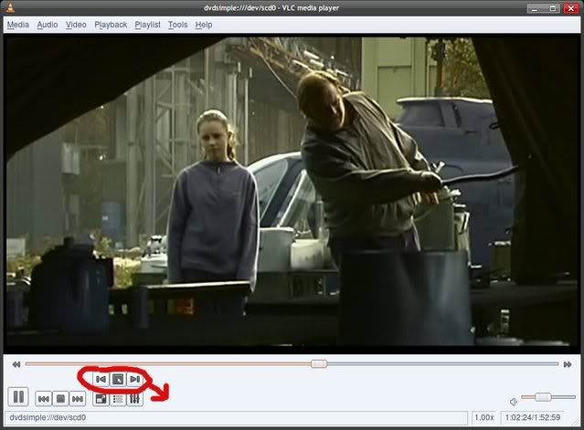
First I would like to say that I very much enjoy VLC. I have been a user for quite a few years now and advocate VLC to anyone experiencing frustrations with video/audio playback. VLC truly is a life saver. With that said, I'm not a fan of the new interface. In fact, I find it to be a huge step back in terms of usability. I have only tried the newer versions on Linux so I cannot comment on other platforms. Personally I think the widgets are ugly but I can deal with that. What I don't understand is why the new buttons cannot use screen real estate more efficiently. I have included a screenshot showing my main complaint. This only occurs when viewing a DVD; playing files from the hard drive doesn't quirk me the same way.

Image

Is there no way to move those buttons down where the rest of the buttons are? Is there any way to disable those buttons without resorting to the "minimal" interface? I can get over the rest of the interface changes but this one actually hinders usability. It just comes off as 2nd rate, especially considering this is supposed to be a new "feature".

3breadt
Big Cone-huna
Big Cone-huna
Posts: 827
Joined: 19 Mar 2006 11:37
Operating System: Win7 Pro / OS X 10.7
Location: Paderborn, Germany
Contact:

Re: Old skin (classic 0.8.*) on new version (0.9.2)

Postby 3breadt » 21 Nov 2008 13:20

Will be possible in future versions.
-- 3breadt (aka altglass)

flyingpengwin
New Cone
New Cone
Posts: 8
Joined: 18 Oct 2007 07:35

Re: Old skin (classic 0.8.*) on new version (0.9.2)

Postby flyingpengwin » 22 Nov 2008 21:12

I know its not helpful and I'm very happy to hear that when 1.0 comes out (O, congrats by the way!!!) you can create the old wxWidget look. I've personally made all my friends install VLC (some against their will) and eventually every single one of them now will never use another media player. I've been using VLC since about '03 and basically, I'm used to the old look. I liked the old look. It's not that the new one is essentially bad (and some of my friends actually like it) but for people who have been using VLC for so long, we just miss the old look. Whenever you open up a movie and see VLC open up in the wxWidget, it feels like home. I personally feel more comfortable in it just because I'm so used to it. Instead of pitching the new skin completely I think you should offer both, 1 for people who like graphical interfaces and people who want just the minimal look. I guess this is a moot point now because of the new options in 1.0. I just thought I would give my opinion and say more than just "I don't like it"

Jean-Baptiste Kempf
Site Administrator
Site Administrator
Posts: 37523
Joined: 22 Jul 2005 15:29
VLC version: 4.0.0-git
Operating System: Linux, Windows, Mac
Location: Cone, France
Contact:

Re: Old skin (classic 0.8.*) on new version (0.9.2)

Postby Jean-Baptiste Kempf » 22 Nov 2008 21:29

I know its not helpful and I'm very happy to hear that when 1.0 comes out (O, congrats by the way!!!) you can create the old wxWidget look. I've personally made all my friends install VLC (some against their will) and eventually every single one of them now will never use another media player. I've been using VLC since about '03 and basically, I'm used to the old look. I liked the old look. It's not that the new one is essentially bad (and some of my friends actually like it) but for people who have been using VLC for so long, we just miss the old look. Whenever you open up a movie and see VLC open up in the wxWidget, it feels like home. I personally feel more comfortable in it just because I'm so used to it. Instead of pitching the new skin completely I think you should offer both, 1 for people who like graphical interfaces and people who want just the minimal look. I guess this is a moot point now because of the new options in 1.0. I just thought I would give my opinion and say more than just "I don't like it"
Understood.
Jean-Baptiste Kempf
http://www.jbkempf.com/ - http://www.jbkempf.com/blog/category/Videolan
VLC media player developer, VideoLAN President and Sites administrator
If you want an answer to your question, just be specific and precise. Don't use Private Messages.

snake eyes
Blank Cone
Blank Cone
Posts: 10
Joined: 08 Oct 2008 14:27

Re: Old skin (classic 0.8.*) on new version (0.9.2)

Postby snake eyes » 24 Nov 2008 09:27

hmm...was looking at the player at a lan this weekend and noticed something that put me off a lil too :(

when a vid is playing, I liked the old setup where the play controls are at the top of the video while the search bare moved along the bottom
and the status bar at the bottom also seems to be reversed order (small thing though)


Return to “General VLC media player Troubleshooting”

Who is online

Users browsing this forum: No registered users and 42 guests